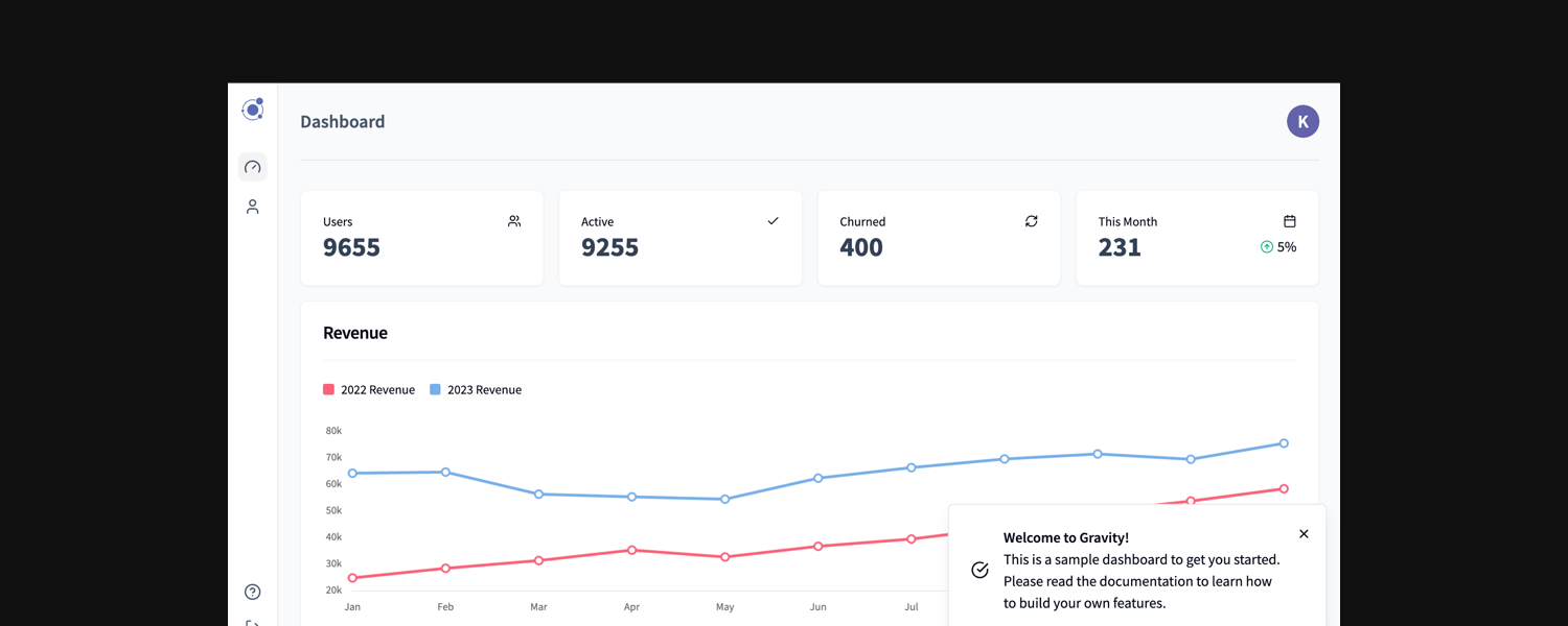
I'm super-excited to announce the latest update to Gravity, a beautiful, accessible new user interface powered by Shadcn.
What Is Shadcn?
Shadcn is a sleek and robust design framework that focuses on developer efficiency, aesthetics and accessibility. Unlike traditional UI dependencies, Shadcn can be customised extensively.
Why I Chose Shadcn for Gravity
Gravity has always been about offering developers a solid foundation to kickstart their SaaS projects. With Shadcn, I've taken this a step further by enhancing the UI capabilities of the boilerplate. Here’s why Shadcn stood out:
- Component Richness
Shadcn offers a rich set of pre-built components such as modals, cards, and forms that are essential for any SaaS product. These components are ready to use yet flexible enough to be tailored to your specific needs. - Tailwind CSS Integration
Built on top of Tailwind CSS, Shadcn provides developers with a familiar styling approach. This allows you to maintain consistent design throughout your app. Custom styles can also be applied with SCSS if that's your jam. - Customization at Its Core
Unlike many UI libraries that lock you into specific styles, Shadcn emphasizes customization. You can modify every element to suit your brand’s identity without digging deep into the framework. - Improved Developer Experience
Shadcn’s integration into Gravity focuses on speed and simplicity. You can quickly build and scale your UI without the repetitive work that often accompanies front-end development. Faster development means you can focus more on the core features of your app. - Accessibility and Performance
Every component built with Shadcn is optimized for accessibility and performance, ensuring that your SaaS app is not only visually appealing but also user-friendly for all customers, regardless of device or ability.
What's New?
- New components: Calendar, OTP, Toast, Popover, Sheet, Tooltip, Dropdown, Popover, Separator
- <Icon> image prop renamed to name.
- <Icon> pack changed to Lucide (more than 1,500+ icons available).
- Removed <ProgressSteps>.
- <Loader> icon is generic (no longer the Gravity orbit logo).
- <Image> source prop renamed to src
- Removed <Card> from within <Stat> so all components are naked.
- Moved <Checklist> into root /components folder.
- <Form> state management uses react-hook-form.
- <Form> payment logic moved to <PaymentForm>.
- <Form> updateOnChange depreciated, use onChange for callbacks.
- Depreciated <Header> and <Link> components from <Form>
- Move <Card> change handler from <Form> to <Card> input.
- Put form input map into map.js file and added support for custom validation rules for each input. complexPassword is now: validation: { complex: true }
- <Form> default renamed to defaultValue.
- <Modal> is renamed to <Dialog> and context.open.dialog().
- <Dialog> callback is handled in the Dialog, not <Form>.
- model.text renamed to dialog.description.
- <Form> callback returns server res and local data object - affects editRowCallback in <Table>.
- <Message> renamed to <Alert> and text prop renamed to description.
- Removed <Helper> and <BlankslateMessage>. Use <Alert> instead.
- Split nav into <Vertical> for desktop and <Drawer> for mobile.
- Depreciated <AuthNav>.
- New <SubNav>.
- New <AuthLayout> .
- Moved dark mode switch to <User> dropdown.
- Moved locale picker to <User> dropdown.
- Moved locales to settings.json.
- context.notification.show() renamed to context.notification()
- Depreciated banner notification – using <Toast> instead.
- New auth page design.
- Depreciated <Glass>.
- useAPI hook stops loading in event of error.
- useAPI accepts a trigger to force reload the API call.
- New <Table> design uses existing functionality not Tanstack from Shadcn.
- <Chart> legend prop renamed to showLegend.
- Moved <Event> to /utils and its params is now an object.
- Deconstructed props on all views and components.
- Removed <ClassHelper> in favour of cn.
- <Button> goto is now url.
- Moved <Search> debounce function to /utils.
- Improved performance of all views, reduced number of renders.
- Added useSearchParams export to lib.js.
- Darkmode.
- Removed restrictWidth from <Card> use <Row> wrapper instead.
- Moved <Breadcrumb> to /components (from /components/nav).
- New <Detail> for visualising key/value pairs.
- Dynamic pagination.
Get Started with Gravity 12 Today
Gravity 12 is now available for all new and existing customers.
Buy Now
